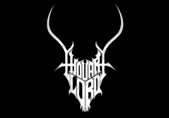
 5. Thou Art Lord – Thou Art Lord’s first logo was sort of a cross between the Mysticum and Mayhem’s logos. Not sure why they changed it—several times, in fact—to a dumb font or a hand-scrawled atrocity, but the Greek supagroup got it right. Just look at it! It’s Christ’s greatest foe. The symmetry and detail are amazing. From horned stems of the ‘t’ in ‘thou’ and ‘art’ to the bearded ‘o’ and ‘r,’ the logo screams black cool. And it’s readable, which is a bonus when attending Christian Revival Meetings.
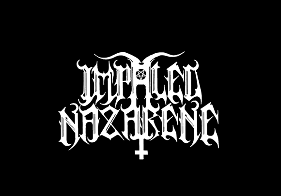
4. Impaled Nazarene – No real translation required here. Impaled Nazarene’s logo looks exactly as the name sounds. The lettering is harsh, angular, and readable — necessary when you name your band Impaled Nazarene. The Finns also incorporated not just an inverted cross, but a pentagram and horns, all of which center the logo as it slightly arcs up in the middle. There are vestiges of symmetry, primarily around the middle letters of the band name. That’s probably the point. Imp Naz’s logo draws you right into the good stuff.
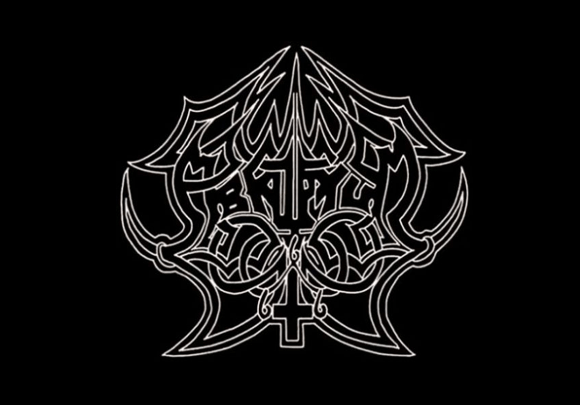
3. Abruptum – Abruptum’s logo changed for the better on 1993’s Obscuritatem Advoco Amplectere Me. Like maybe Unleashed’s killer logo, this one’s all symmetry. The requisite inverted cross is present. Yet unlike many, Abruptum snuck in the triple 6 at three of the invertie’s four points. Class! Yet like many, the Swedes chose to partially obcsure their moniker in a confounding array of Viking-esque interlocking line designs. In fact, if you didn’t know it said Abruptum, which is Latin for ‘abyss’ or ‘chasm,’ it might be some smart looking Lovecraftian art of unknown and arcane origin.
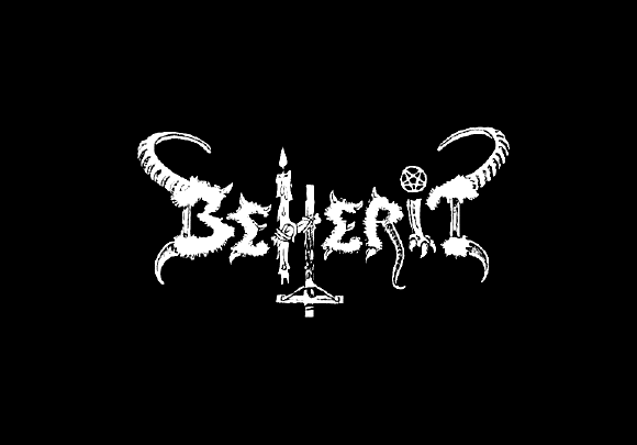
2. Beherit – Beherit logos are damned good. Well, the demo logo ain’t much, but on The Oath of Black Blood the Finns affixed one of the ugliest badges of evil we’ve ever seen. Devil horns and claws protrude grotesquely out of the ‘b’ and the ‘t.’ The ‘h,’ which serves as the blasphemous centerpiece, has a candle and an inverted crucifix — which Jesus is brutally nailed to it — growing out of its stems. And the ‘i’ is dotted with a barely discernible pentagram. The thicker attributes of the letters have a beastly quality as well. Like the tail that forms the ‘r’ stem. Shivers, baby. Shivers.
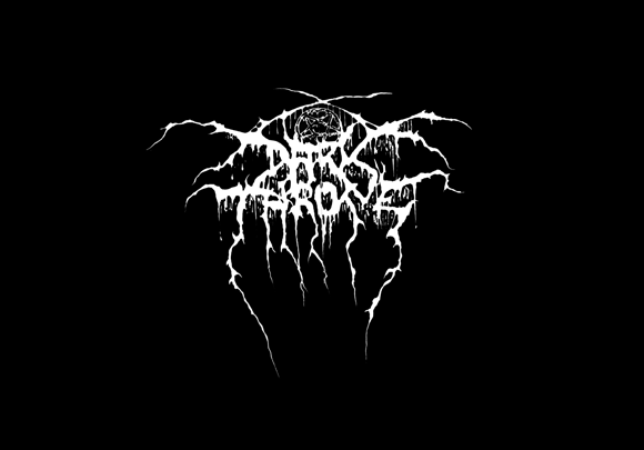
1. Darkthrone – When it comes to black metal logos—which are predominantly based off old English or Fraktur fonts—this one is easily the best. ATG/Disfear frontman Tomas Lindberg inked this logo before Fenriz and Nocturno Culto were monochromatic, but it works equally well as a black metal logo. It’s almost symmetric, the pentagram uncomfortably distorted and the letter stems, particularly the ‘d,’ ‘k,’ ‘t,’ and ‘e’ letters, could either be ooze from Satan’s great oak or fulgurant black magick. Pure fucking armageddon.
** The five runners-up: Immortal (barbed wire, claws, invertie, and ‘gram. Yeah!), Watain (scrawled-by-cavemen evil), Gehenna (batwings, a sanguine sun, and cthulhu tentacles-like ‘g’ and ‘a’? Awesomeness!), Naglfar (an electrical storm of devilish proportions), and Deathspell Omega (regal yet really wicked).