 5. Sabbat
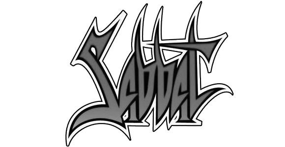
Brit thrashers Sabbat were among a select few to come from the island to have made a genuine impact. To this very day, Dreamweaver remains singular. The group’s logo also has similar import. Like most thrash metal logos, it’s readable at a distance yet it has an edge to it. Each letter in Sabbat has a purpose. The way the “S” zigs, the points at the top of the “B” stems, and the way the “T” crosses back into the word Sabbat. Typically, the logo is outlined, which only adds to its visibility. Sure, there are plenty of thrash metal logos that look more “metal” or have more “edge”, but few of them have balanced like Sabbat.
4. Dark Angel
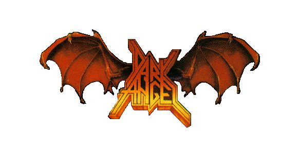
Cali thrashers didn’t get their logo right until the Leave Scars release. The first two iterations—first with We Have Arrived and second with the purple awfulness of Darkness Descends—weren’t fully realized, to be honest. The word “Dark Angel” is plenty killer. The way the letters angle into one another is pretty genius. Though the fill under the “N” in “Angel” is strange—now fixed with the revitalized Dark Angel—but what really sets this logo off are the demon wings. Again, by Leave Scars the wings had come in and were detailed to such an extent that young ‘bangers were quite intimidated by what might be powering them.
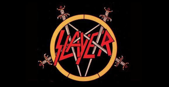
3. Slayer
Like most bands with tenure, there are several versions of Slayer’s logo. From Show No Mercy through Reign in Blood, Slayer used slightly different stylings of its SS/sword pentagram logo. The early versions sported dripping blood, while the later versions omitted the blood and cleaned up the lettering and sword work. While personally I prefer when the SS/sword logo was paired with the single-headed eagle—again, a nod to WWII iconography—it’s the version that appeared on the group’s Def Jam records that seal the deal. Certainly, it wasn’t the logo from Diabolus in Musica or the crayon version that appeared on the cover of Christ Illusion.
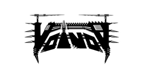
2. Voivod
Instantly recognizable and instantly horrifying—a sort of Mad Max like machine of a logo—is Voivod’s Rrröööaaarrr-era brand. Voidheads will certainly argue with me on this one, however. There’s the totally cult To the Death logo, or the Nothingface circuit logo, or the art nouveau aspects to the Angel Rat logo, but none of them hold a candle to what first appeared on Rrröööaaarrr. When paired with the evil robot head, it paints a vastly different picture from most fantasy-themed logos of the day. There were no swords, crests, shields or heraldry in Voivod’s logo. No, just full-on sci-fi techno death. And for that reason, this is why Voivod sits so high up on our list.
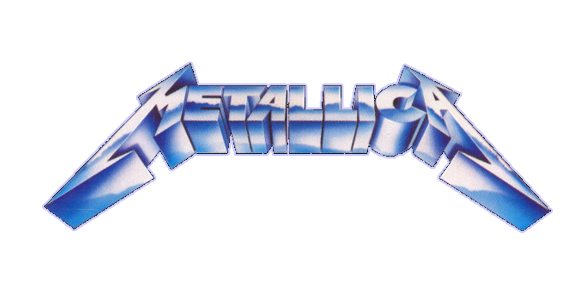
1. Metallica
The Kill ‘Em All logo should get the nod here, but we’re giving full props to the Ride the Lightning brand. It’s 3D-esque, where the entire word “Metallica” is tilted from the bottom up. The tilt gives it a heightened sense of import. True, the logo has a double stroke to make it pop, but the edges are just plain mean. The classic “M” and “A” signal the beginning and end. And it’s highly legible, not just by ‘bangers in denim and spikes, but by defensive moms and pops. When they saw the logo “back in the day” they knew it meant danger and/or undesirable music made by wayward early 20s men. The Kill ‘Em All logo returned for …and Justice for All only it was debossed.
Honorable mentions: Seventh Angel, Holy Terror, Sepultura, Death Angel, Corrosion of Conformity, Forbidden, and Toxic Holocaust.
Visit our Top 5 Logos list posts:
1. Decibel’s Top 5 Black Metal Logos (HERE)
2. Decibel’s Top 5 Death Metal Logos (HERE)
3. Decibel’s Top 5 Doom Metal Logos (HERE)

