
5. Carcass – Carcass has had a few logos over their storied and infamous career, but none of them evinces the manic, electric quality of the group’s music quite like this iteration. Its angular, slightly italicized letters, the long stems of the two “c”s and “r,” and the near interlocking of the double “s” imparts an urgent feel. The static, or whatever it is, that emanates from all sides gives the logo a hurried look, as if Carcass are aching to go somewhere; probably six feet under with their medical dictionary in hand.
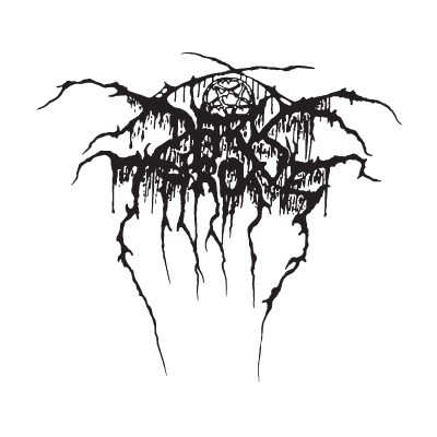
4. Darkthrone – OK, we’re partial to this logo for several reasons. Sure, it showed up as #1 on our Top 5 Black Metal Logos post (HERE) and Darkthrone were really a death metal act for only one record (the iconic Soulside Journey), but few logos are as complete as this one. The hidden pentagram. The murky, root-like drips dangling off the crudely scrawled letters. The near-symmetry of the “horns” and “legs.” Yeah, logo designer Tomas Lindberg was on-point when he conceived this piece.
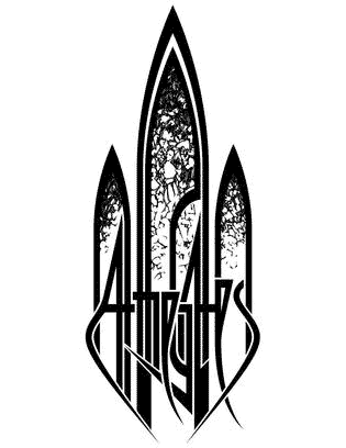
3. At the Gates – There’s an ecclesiastical vibe play here. The trinity of arched windows, stained glass, and vertical design give the logo a regal look. At The Gates smartly improved upon Alf Svensson’s Gardens of Grief logo for debut album, The Red in the Sky is Ours. Not sure who designed this iteration, but it’s probably one of the more unique logos to ever grace an album cover. It’s religious by being anti-religious. Read the lyrics to “Kingdom Gone” and you’ll get what I’m saying.

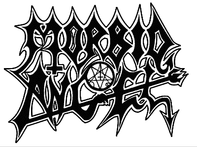
2. Morbid Angel – One of the more classic death metal logos. The Morbid Angel logo is highly recognizable, readable, and it has two devil tails, a pitchfork, a pentagram, and an inverted cross. There’s no real way to candy coat Morbid Angel’s intent. From first glance to close inspections, the Floridians wanted to convey evil at every crenelation. It might look a bit dated now, but there’s no denying Morbid Angel’s logo class.
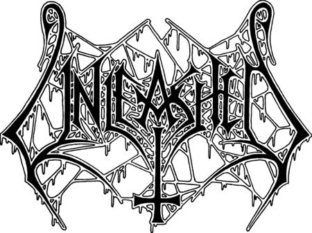
1. Unleashed – When Unleashed formed, few could’ve expected such an awesome logo. It’s been slightly revised over the years, the most recent alteration was on last year’s excellent Odalheim effort. Regardless, the original Unleashed logo is a death metal original. Symmetric—well, almost—with angry, angular lettering, tons of dripping ooze (evil, of course), and a massive inverted cross. The hoi polloi never needed a second look at this monster. The inverted cross immediately communicated, “I am evil.” Didn’t matter if they couldn’t read the rest.
** The five runners-up: Obituary (those hooks!), Death (a little goofy in retrospect but still a Kam Lee classic.), Incantation (oh, the roots are alive! alive!), Bolt Thrower (stained glass with a board game feel. fuck yes!), and Dismember (imagine if this was “Dismemberizer”?! glad that sheet of paper was short.).

