There’s nothing cooler than a logo, a mark, an emblem. From extreme music’s inception, artists–thrash metal, grindcore, death metal, doom metal, black metal, etc.–have placed a heavy weight on their logos. Some are immediately recognizable (like Metallica, Death, Morbid Angel, Napalm Death, Cathedral), some aren’t so cleverly designed. Over the years, Decibel has top-listed logos for our most favorite of extremely extreme genres. Our first, a controversial list of death metal logos set the Internet afire. Our second, another list, this time black metal logos, generated waves of fuck-yous and idle threats. Our third, a subdued stack of doom metal logos, was far more genial. Must be doom metal fans are either baked beyond belief or too morose to care. Our last list, some three years ago, categorized our Top 5 thrash metal marks to a sizeable audience agreeing with our list. Now, we prepare for yet another digital ribbing by unfurling the latest list: Decibel’s Top 5 Grindcore Logos, or as the title we wanted to use: Top 5 Readable Logos For Slow People.

5. Wormrot. Three insane Singaporeans dreamed up this logo while throwing bubble gum on sidewalks and watching Bruce Lee movies. Actually, according to Wormrot, it was vocalist Arif Suhaimi who designed the logo based off Japanese calligraphy. Whichever story is true (ours isn’t!), the Wormrot logo rules on all fronts. The vertical and horizontal positioning of the letters is fantastic — though when we first saw the logo, the ‘m’ was a hard find — as is how they’ve combined letters to create a cohesive yet very grindcore aesthetic. There are few better logos than Wormrot’s.
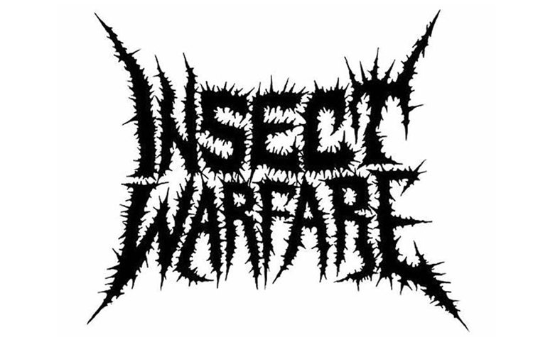
4. Insect Warfare. We had troubles deciding on Insect Warfare’s Michel Langevin-inspired logo and Cattle Decapitation’s ‘abattoir floor’ logo. By a bloody, singed hair, we picked the Texan’s brutal brand. It just has that I’ve-been-spiked-through-every-part-of-my-body ‘feel’, with the four corner prongs sticking out to honor classic metal marks. Part of the reason Insect Warfare’s logo ended up on our list is that it’s also readable. On t-shirts, on websites, on leggings (guaranteed to be sold next year at MDF!), it doesn’t fuck around. And it also doesn’t play into the band’s name, which is a plus.
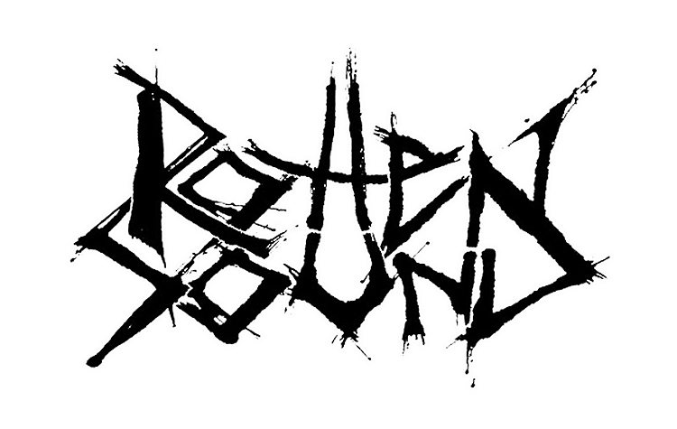
3. Rotten Sound. The slow-witted Finns nailed it with the design on this logo. They way they connected the letters, the letter stack, and the little homage to grindcore logos past with the splatter effect is subdued but genius. The concave effect on ‘rotten’ gives the mark a sense of movement as well, which is perfect for a band that plays as fast as Rotten Sound. The corner letters ‘r,’ ‘n’, ‘s’ and ‘d’ are strongly presented, again owing much to metal emblems past and present without the exaggerated blowouts that have plagued poorly conceived logos of lesser bands.

2. Anal Cunt. This logo is Flintstones level stupid. The ‘a’ forming a hairy asshole and the ‘c’ forming a dripping vagina are all kinds of legend in grindcore and death metal circles. Clearly, the logo, or abbreviation, was meant to offend moms, dads, distributors, and black metallers (who were just beginning to walk), and it worked. While Anal Cunt were fairly underground, Relapse Records marketed the Massholes heavily, particularly around the Morbid Florist EP. Earache took it up notch with the release of Everyone Should Be Killed a year later. Anal Cunt shouldn’t be left to dust and Internet memory. R.I.P. Seth Putnam.

1. Napalm Death. The most iconic grindcore emblem ever created. Period. The frenetic quality of the lettering equaled only the insane speed at which Napalm Death levied their noise. In many respects, the logo communicated exactly what songs like “You Suffer”, “Instinct of Survival”, and “Siege of Power” sounded like. Up close, the Napalm Death logo looks like electricity. From afar, the Brummies’ legendary design has a bone feel. Jeff Walker–yes, that Jeff Walker–crafted Napalm Death’s logo after then-drummer Mick Harris politely asked, “Would you be so kind as to scribble up something quaint for us?” OK, it didn’t go that way, but we’ve dreamed it did.
** The five runners-up: Terrorizer (melting candle or blood in the process of coagulation), Repulsion (Helga lost her head to this horror movie font logo), Brutal Truth (did a Neanderthal scrawl this logo on a cave wall? Possibly), Dead Infection (there’s a monster in there somewhere. Infected and dead), and, last but not least, Cattle Decapitation (the floor of an abattoir formed into words ‘cattle’ and ‘decapitation’. Awesome!).