Without a suitably metal-looking label, that IPA on the shelf is just another brew in a sea of similar beers. In the same way that there is a style and technique to playing music that makes it “metal” (i.e. distortion, aggression, etc.), a beer is just a beer until you slap a brewtal metal-inspired label on it. Sure, brewers can make an extreme beer that sort of mimics metal’s savagery, but that’s not really made obvious unless the accompanying label looks metal. The art of metal beer labels is a relatively new phenomenon. It’s a great way for breweries to both distinguish their product on shelves, fly their metal colors and potentially attract metalheads to their product.
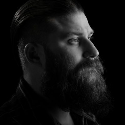
We wanted to peel back some of those labels to see who’s behind these creations. We started with Hired Guns Creative, a small four-person business in Nanaimo, British Columbia, Canada, that earned its metal bona fides designing beer labels (among many other branding efforts) for Victoria, BC brewery Driftwood. Creative Director Richard Hatter—an unabashed metalhead—gave us the details.

Do you listen to any particular bands or kinds of music when you’re doing some of your more brutal or metal-inspired labels?
RICHARD HATTER: Yes, I do. It ranges from stoner sludge/doom to groovy and tech death. I was listening to Bison and Electric Wizard when I first started taking the Driftwood Brewing labels darker. The Obscuritas Dark Sour label was created while spinning Bison albums. Then I got a lot heavier while I was designing subsequent Driftwood labels with Vital Remains (Suzuki era) and Origin. Now I’m all about tech death. Being Canadian, it’s required.
What level of direction do breweries typically give you for these types of designs?
HATTER: They don’t really. They’ll say I want it to be “metal” so I give them metal and it scares them, so then I water it down a lot. I will give someone truly “dark” design if they can actually back it up. I’m a Satanist, and I can smell it on people.
How much are you thinking about the beer itself—the taste, the colour, the style—when rendering a design?
HATTER: We call our process “Design to Flavour” so the taste, colour and style are a huge part of how we work. [Driftwood’s Strong Golden Ale] Son of the Morning is 10% alcohol by volume—that’s a hell of a beer!

Do you primarily do all of your work electronically, or do you use “analog” formats—paper, pencil, ink, etc.—for sketching or even final product?
HATTER: Because of time constraints, I don’t spend time on paper anymore. I go straight into vector using a Wacom Cintiq and an iPad Pro. These tools have replaced the need for actual paper.
Do you have a favourite metal-influenced beer label you’ve done and why is it your favourite?
HATTER: [Driftwood’s] Son of the Morning, because when I was designing it I was listening to Blasphemy Made Flesh from Cryptopsy. Steve Thibault played rhythm guitar on that album and it turns out he’s also the Driftwood Brewing rep in Calgary. I had no idea—it was a funny coincidence. I did have to re-work the typography several times for legibility on that label. I initially went really brutal with it and normals couldn’t read it.

What creative or artistic influences do you draw on when doing these labels? Are there, for instance, album artists that have inspired you, or comic artists?
HATTER: I try to bring metal culture to the beer shelf with dark labels. I’m inspired by tech bands because they really push themselves to make something special, knowing the fans won’t accept anything that isn’t phenomenal. I don’t look at other designers these days as I don’t want outside influence creeping in. I look to old artists of lost generations for inspiration now; I like the old biblical oil paintings and Dore engravings. I spend a lot of time in a room full of skulls, urns and other historical occult items I collect for inspiration and emotion.
Do you have any previous experience doing cover art for metal bands or posters for metal shows
HATTER: This is my white whale. I don’t have any real bands in my portfolio, mostly because I’m so busy with alcohol and cannabis work that it would take a real budget to book some of my time. I really do want to work in the metal area but can’t start at the grass roots level right now. I almost did branding and art for a friend’s band a few years ago, but that turned out to be at the same time when we blew up in the design scene. There just wasn’t time for free work anymore.
If you could design an album cover for any band in the world, who would it be and why?
HATTER: What a tough question! I’m really loving what The Artisan Era [record label] is putting out musically; it would be fun to match art with any of their artists. I think Vektor would be amazing—their last album was a true masterpiece. But I think Mithras would be a serious challenge with where they are going content-wise. I would have a lot of fun there.


